Tablet users will see your feature graphic, too
 As of today, your Android apps must include a feature graphic and a short description text before you will be allowed to save any other changes to your Google Play listing.
While it’s nice that Google is encouraging (well, forcing) developers to put more consideration into creating an appealing Google Play listing — even if it doesn’t make sense for many apps — much like any other aspect of Android development, it’s worth thinking about how your feature graphic will appear on different devices, in differing configurations.
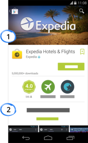
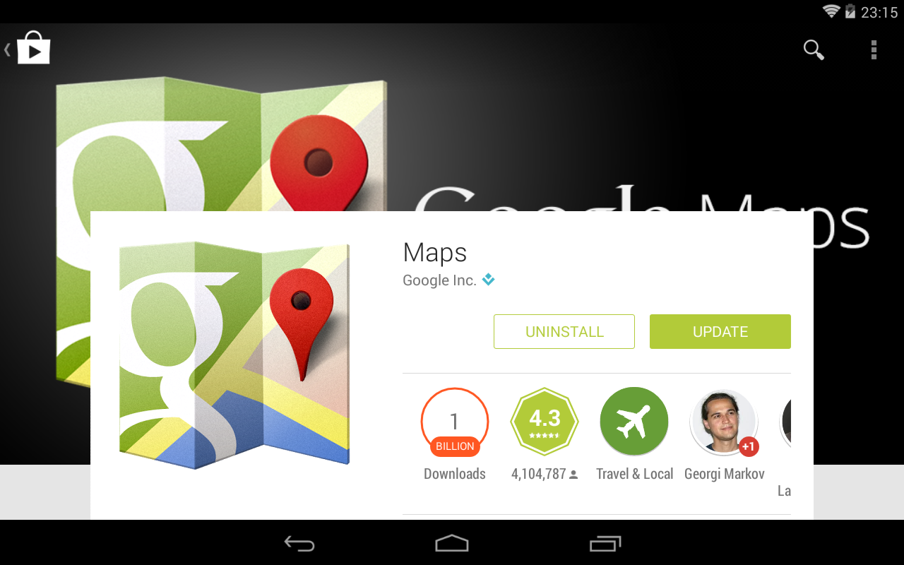
Google’s feature graphic example showing the Expedia app does indeed look pretty nice. However if we look at the same listing on a Nexus 7 tablet in landscape orientation, we get a slightly different picture:

Further examples
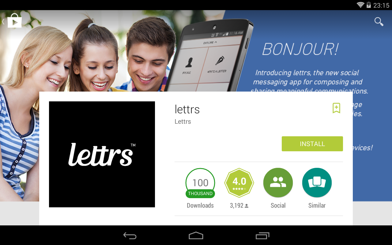
There are plenty of apps out there with feature graphics containing large blocks of text, including the company or app’s branding, which end up being pretty much entirely obscured. Given that Google Play also gives a lot of space to the the high-res app logo while in landscape, it’s clear that for many apps it’s quite redundant to include another, even bigger copy of the app icon in the feature graphic.
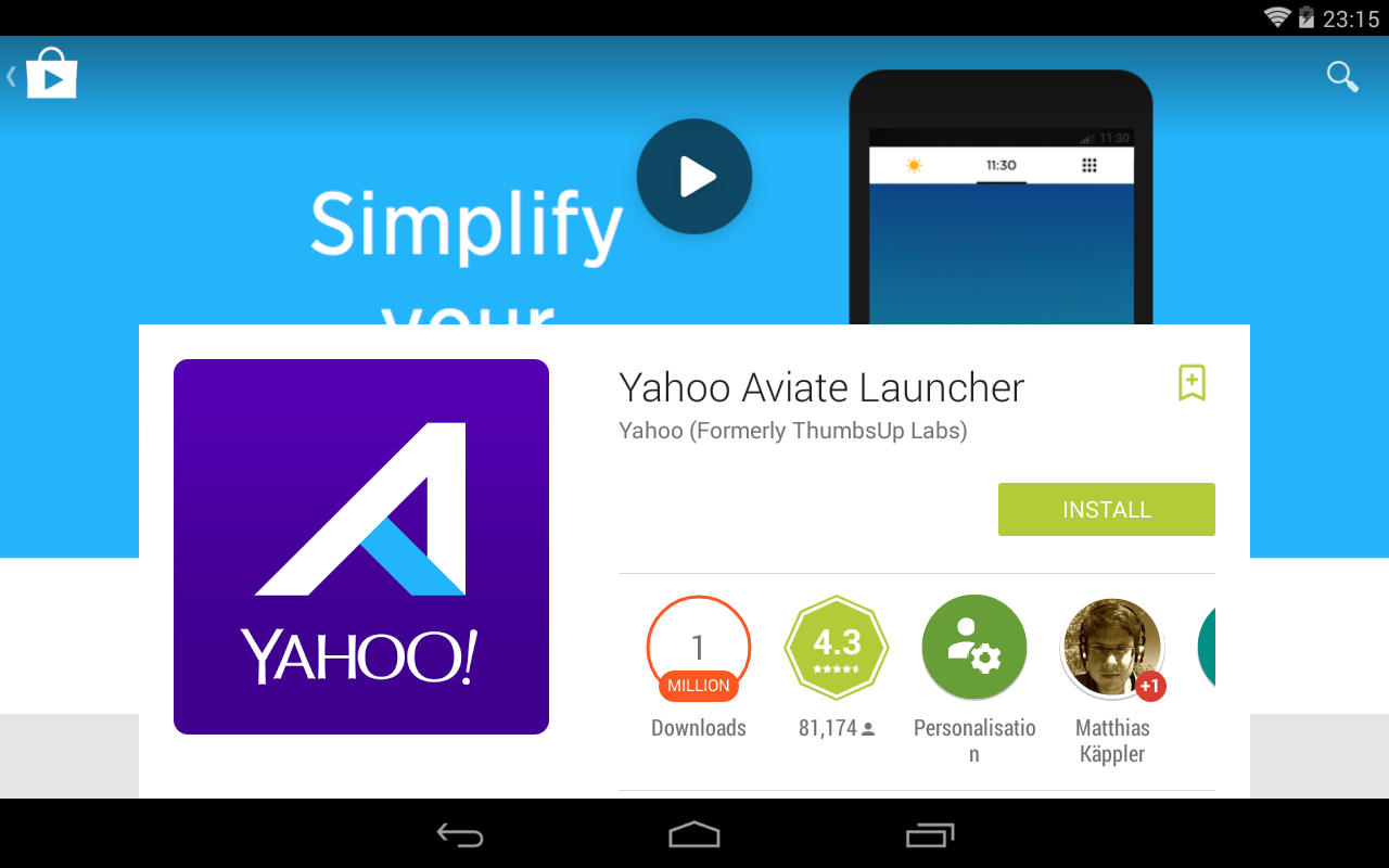
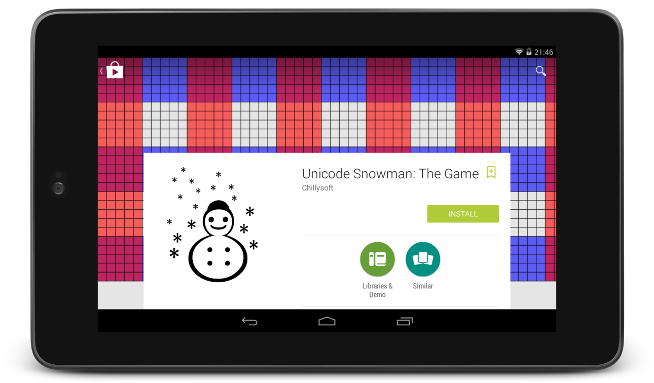
While the feature graphic is fully visible on phones and tablets large and small when in portrait orientation, it’s clear that some developers could do with checking their app in Google Play on a tablet:
How much space do we have?
While feature graphics are pretty much unobstructed while in portrait orientation (minus the icons and actions in the transparent action bar), where should we be placing our important graphical elements so that it all looks good in landscape?
To test the image layout in different configurations, I uploaded an app to Google Play, using a grid for my feature graphic: a 1024x500 pixel PNG, with grid lines every 20 pixels, and shaded blocks every 100 pixels.
Smaller screens, like the Nexus 4, show the full width and height of the feature graphic in landscape:

The full 1024px width of the image is always shown, but seven-inch tablets like the Nexus 7 will display fewer than 220 pixels of the images’s height before it becomes obscured by the app info overlay.
Almost half of the feature graphic’s area will not be visible in landscape orientation.
On a ten-inch tablet, the lower 40% of the image seems to be obscured, whereas only a little more than 80 pixels can be seen at each side of the app info overlay:

Note that these values are not absolute, as various devices have differing aspect ratios, so it’s possible that slightly more or slightly less of the feature graphic will be obscured by the overlay.
So take a moment to look at which parts of your feature graphics are important such that they shouldn’t be obscured, regardless of the screen orientation and size they’ll be viewed on.